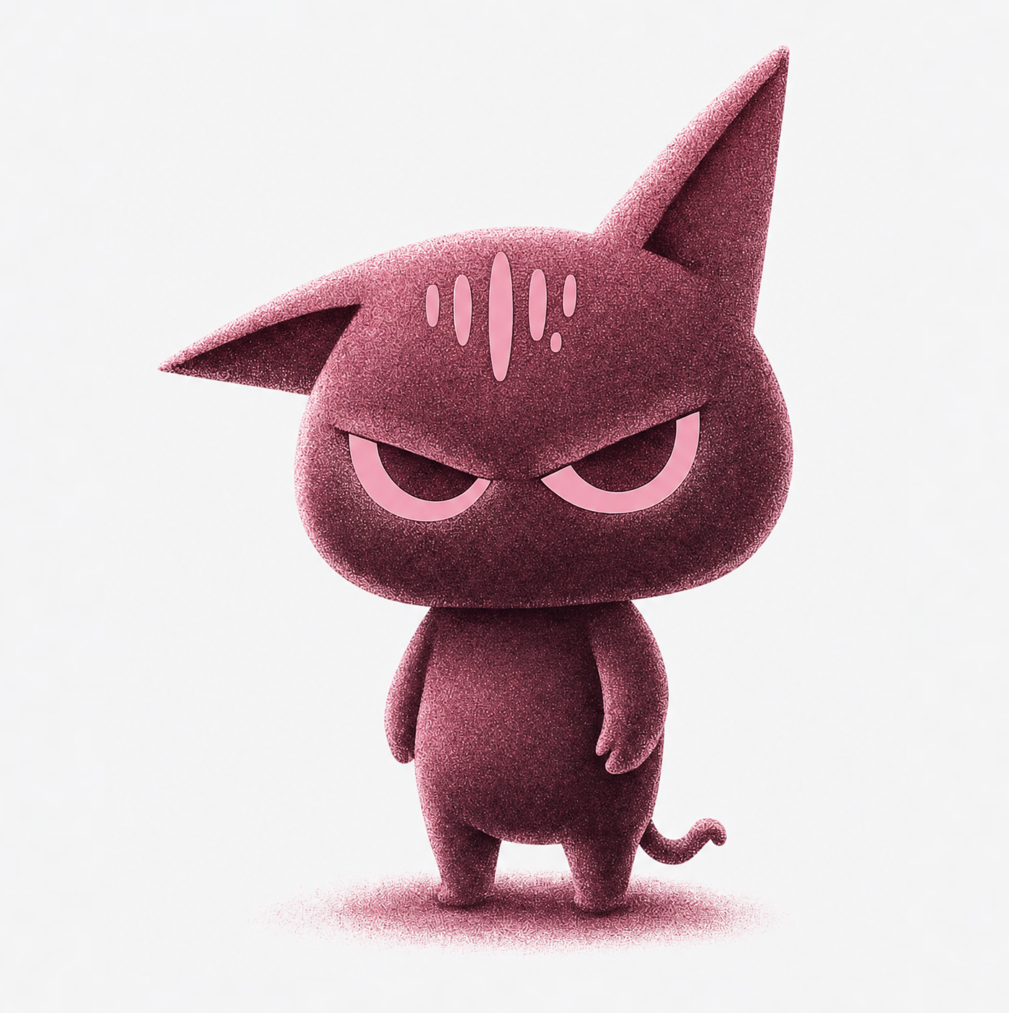
What makes a logo usable (prompt for these)
Good logos survive three tests: one idea (not a scene), silhouette (recognizable as a shape alone), and scale (legible at 16 pixels and on a billboard). Bake the tests into the prompt: 'minimal', 'single concept', 'strong silhouette', 'flat vector, white background', 'one color' or 'two colors'. Constraints are the design.
Skip gradients, photorealism, and fine detail on a first pass — they're what make AI logos look like clip art. A mark that works in one flat color can earn embellishment later; a mark that needs embellishment to work doesn't work.
Prompting the three logo families
Pictorial marks and badges: name the symbol, the layout, and the industry — 'monoline mountain badge logo for an outdoor gear brand, circular emblem layout, single color'. Abstract marks: describe geometry and feeling instead — 'abstract mark from two interlocking arcs, suggests connection, flat two-color'. The industry cue steers the mood more than you'd expect.
Wordmarks are type-led, and Recraft v4.1 handles short names better than any of our other models — but inspect every letterform before you commit, and treat generated lettering as a direction to refine rather than final type. For longer names, generate the symbol and set the name in a real typeface yourself.
Iterate like a designer, not a slot machine
Round one is breadth: eight to ten distinct directions from different symbol and layout briefs. Kill the weak ones fast. Round two is depth: take the strongest mark and change exactly one variable per generation — line weight, geometry, enclosure shape, color count — so you can tell which change earned the improvement.
Test every finalist small. Shrink it to favicon size and squint; if it turns to noise, simplify the prompt ('fewer elements', 'thicker lines') and rerun. This is the discipline that separates a logo from an illustration that happens to be round.
From render to brand asset
Once the mark is chosen, production is built in: the background remover gives you a transparent version for layering onto sites and merchandise, and the upscaler takes it to print resolution for signage. Generate a one-color variant with the same prompt for uses where color printing isn't an option.
Then put it in motion — the Logo Reveal app animates a finished mark into a short video ident for intros, outros, and social, which is usually the first place a new brand needs its logo to perform.