The anatomy of a sticker prompt
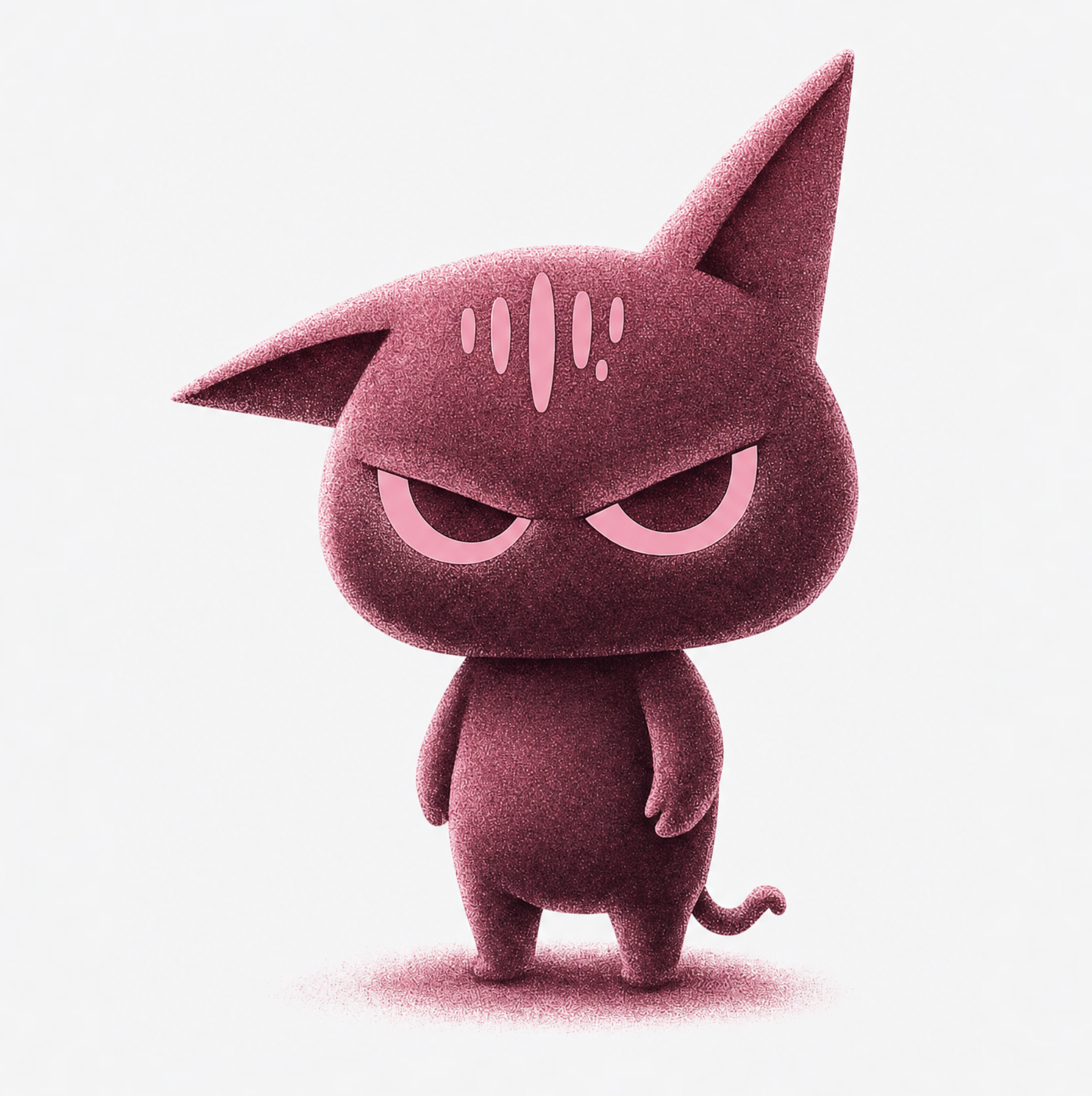
The magic words are 'sticker design, thick white die-cut border, bold black outlines, flat colors, simple shading, white background'. The die-cut border is what makes it read as a sticker rather than a clipart blob; the bold outlines are what survive printing at 5cm. Add one exaggerated emotion — sleepy, smug, ecstatic — because stickers are emotional shorthand, and understated expressions die in chat threads.
Building a coherent pack
Sticker packs sell (and stick) as sets. Lock your character description and style words, then iterate only the emotion and pose across 8–16 generations: waving, crying, celebrating, judging silently. Keep the palette to 3–5 colors across the pack — consistency is what makes a pack look designed instead of collected.
Nidhogg renders each in seconds, so a complete pack is an evening project, not a commission.
From chat packs to merch tables
Creators publish packs to messaging platforms; small businesses produce brand-mascot stickers for packaging and swag; artists sell die-cut vinyl at conventions. For physical printing, generate at full resolution, remove the background, and upscale — print shops accept the resulting PNG directly for kiss-cut sheets.