Why a design-native model matters
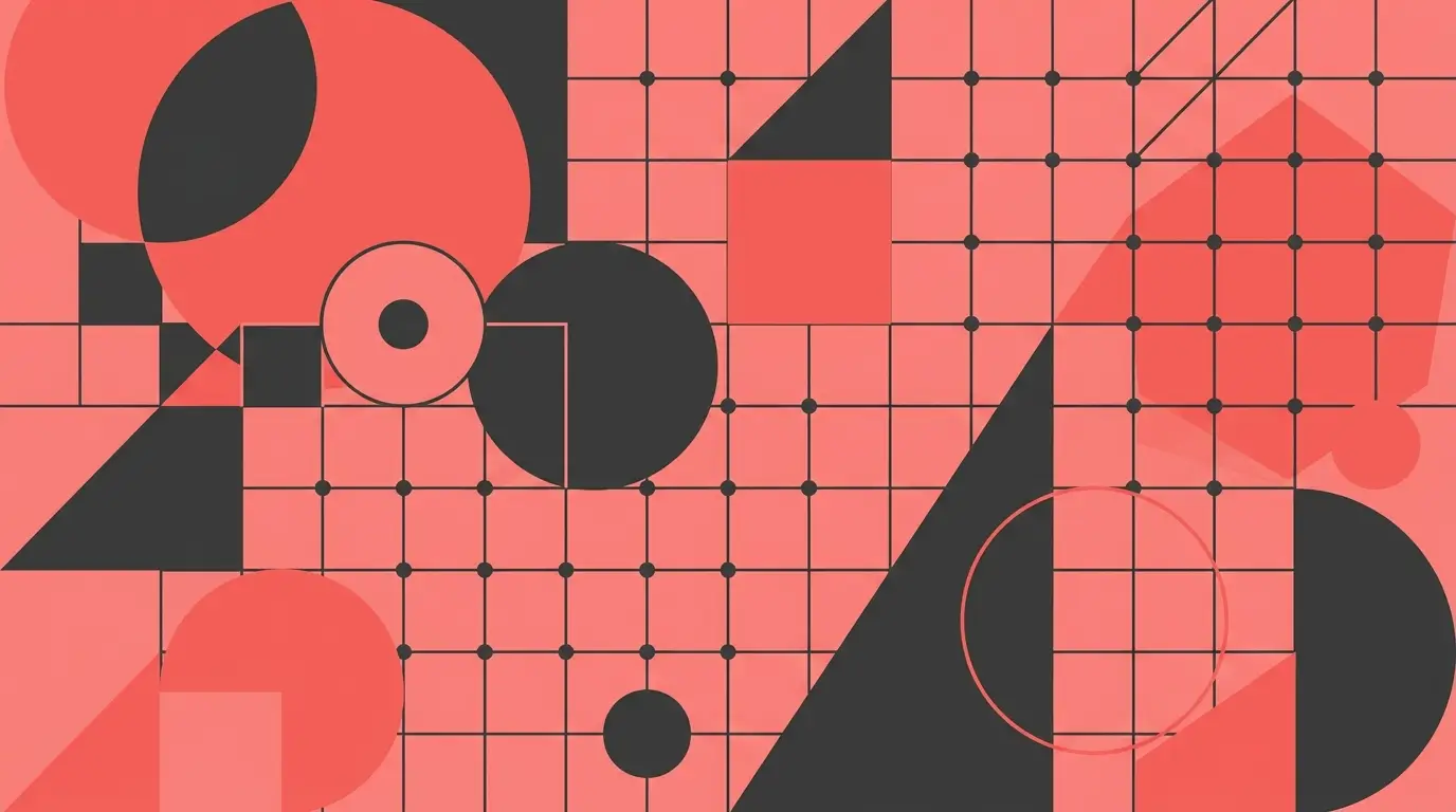
General image models paint; design needs construction. Recraft v4.1 renders flat color without banding, holds straight edges and consistent corner radii, and treats a limited palette as a constraint rather than a suggestion. That's the difference between output you can put in front of a client and output that reads as 'AI image with words on it'.
It also respects layout instructions. 'Clean grid layout', 'headline space in the top third', 'duotone palette', 'flat vector style' — these are terms the model executes, which means you can art-direct structure, not just subject matter.
Write briefs, not vibes
Prompt the way you'd brief a junior designer: deliverable, audience, layout, palette, and what the design must leave room for. 'Event flyer for a jazz night, bold condensed headline space at top, duotone navy and cream, art-deco geometric border, clean margins' will beat 'cool jazz poster' every single time.
Plan for type up front. AI-rendered text is good for short display treatments but you'll usually set final copy yourself — so prompt explicit copy space ('generous clear area in the lower third for details') and drop the text in your editor afterward. If you do want text baked in, Nano Banana Pro is the strongest model for rendered lettering.
From render to production
Generated designs slot into real pipelines with the built-in tools: the background remover cuts elements onto transparency for layering, and the upscaler pushes finals to print resolution for posters, packaging mockups, and merch. T-shirt art works best prompted as 'flat vector style, limited color palette, clean edges on plain background' — it separates cleanly and prints predictably.
For multi-asset projects, build a style block — the exact palette, shape language, and mood wording — and reuse it verbatim across every deliverable. A flyer, a story graphic, and a banner generated with the same style block read as one campaign, not three experiments.
Where it fits in a design workflow
Use it earliest where it's strongest: exploration. Generating eight directions before you open your design tool means you start executing with a chosen concept instead of a blank artboard. Designers use it for moodboards and client option rounds; non-designers use it to get respectable assets without learning layout theory the hard way.
It doesn't replace design judgment — spacing, typography, and brand consistency still benefit from a human pass. What it replaces is the expensive first 80%: getting from nothing to several credible directions.