Choosing a cartoon style deliberately
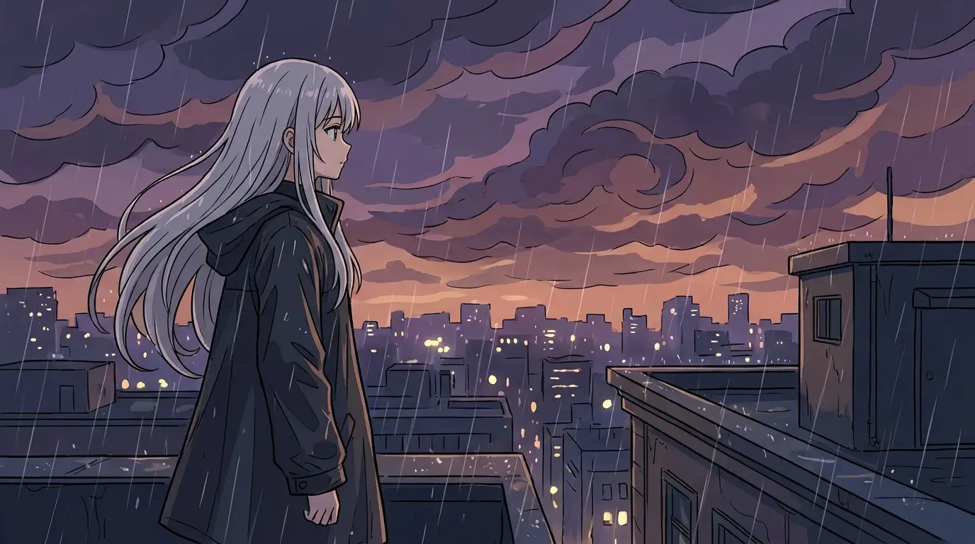
Each style carries a temperature. 3D-toon ("animated movie character style, soft global illumination") reads polished and family-friendly — the safest for brand work. Claymation reads handmade and quirky, perfect for indie charm. Paper cutout reads crafty and storybook. Comic halftone reads energetic and graphic — strong for action and youth audiences.
Commit to one style per project and encode it as a fixed phrase reused in every prompt. Style-mixing between scenes is the fastest way to make an animated piece feel broken.
Writing characters cartoons can carry
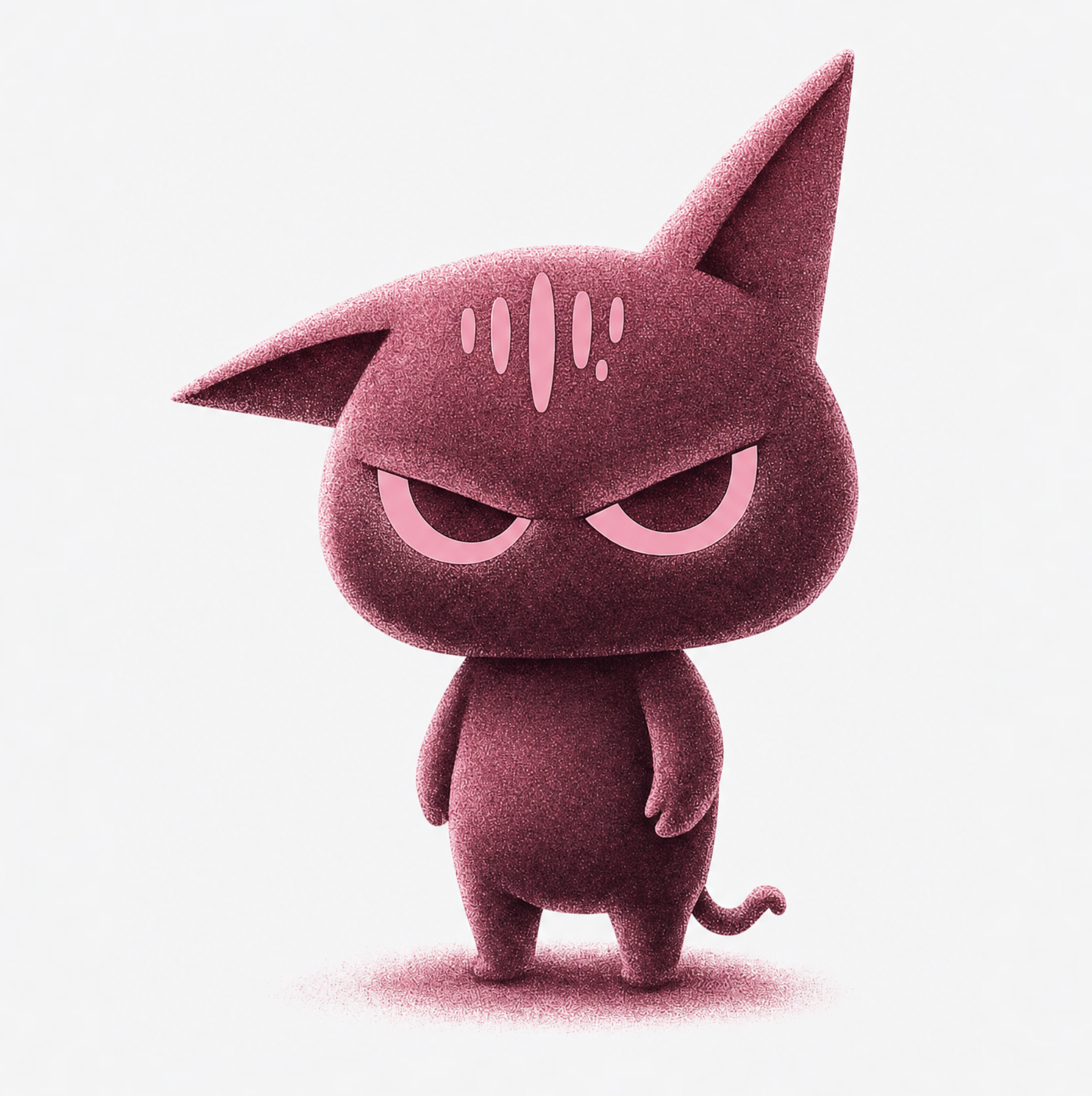
Cartoon characters are silhouettes first: prompt shape language ("a round, waddling penguin with tiny wings", "a tall spindly wizard, all elbows") before colors and details. Exaggeration is the medium's native tongue — big eyes, oversized props, and single-emotion expressions generate more readably than realistic proportions.
For animation-feel motion, prompt squash-and-stretch moments: a character winding up before running, bouncing to a stop, reacting with a double-take. These cues push the model toward animation timing instead of filmed realism.
Where cartoon generation shines
Kids' content and storybook adaptations, where the paper and clay styles feel native. Brand mascot animations — a mascot generated in consistent 3D-toon style becomes a reusable asset across campaigns. Explainers that need warmth realism can't provide, and social content where a distinctive animated look stands out from an infinite scroll of live-action.
Since drawn frames have no uncanny valley, cartoon generation is also the most forgiving genre for early experiments — style covers what precision misses.