The technical rules of email imagery
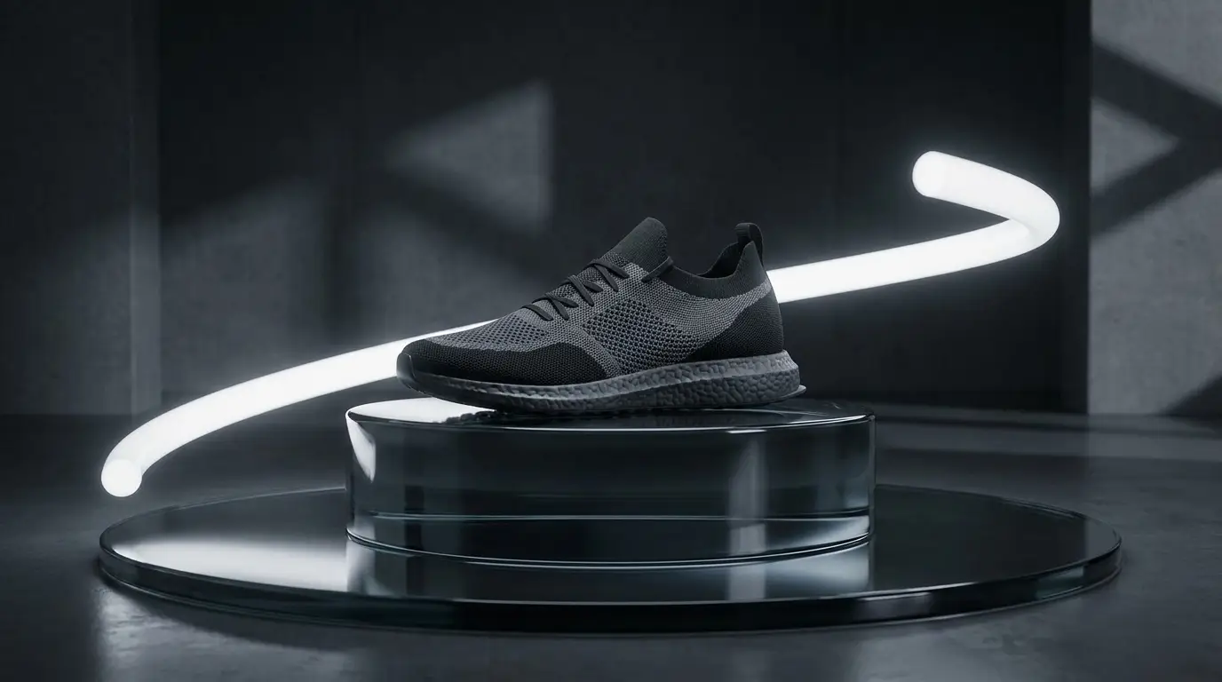
Email bodies render around 600–640px wide, so generate wide-format heroes and export at 1200–1280px for retina sharpness. Keep the compressed file under roughly 200KB — heavy heroes slow load and can hurt engagement metrics that mailbox providers watch. And because a meaningful share of recipients never load images at all, your hero must be decorative reinforcement, never the sole carrier of the offer: the headline belongs in live text, with descriptive alt text on the image.
Design for dark mode before it surprises you
A large slice of your list reads email in dark mode, where clients may invert or recolor backgrounds. Two defensive habits: avoid pure-white image backgrounds that will glare against a dark UI, and never bake dark text into an image expecting a light surround. Soft gradients, mid-tone scenes, and subjects that hold up on any background — prompt for these and your hero looks intentional in both modes.
Batch the calendar, not the campaign
Email runs on a seasonal drumbeat that's fully predictable — which makes it perfect for batching. In one flux-schnell session, generate hero visuals for your next six sends: promo, newsletter, seasonal moment, product spotlight. Keep one consistent visual style so subscribers recognize you in a crowded inbox preview pane, and refresh the style quarterly rather than per-send. Consistency builds recognition; freshness fights fatigue; batching gives you both.