Cover art that survives the grid
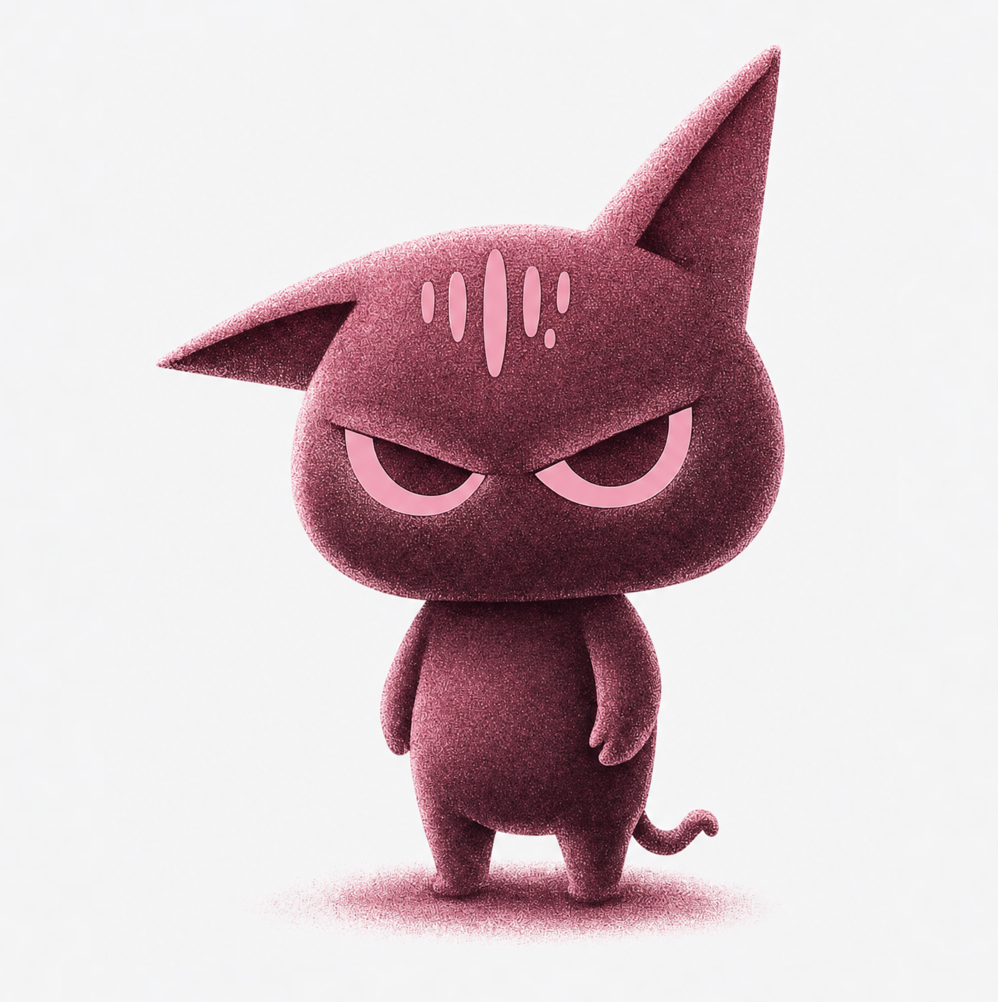
Directories want a 3000×3000 square, but design for the 55px version. That means one dominant visual element, show title in thick readable type, and a distinctive background color that stands out in a chart full of black and navy covers. recraft-v41 is the right model here because it composes like a designer and renders clean type.
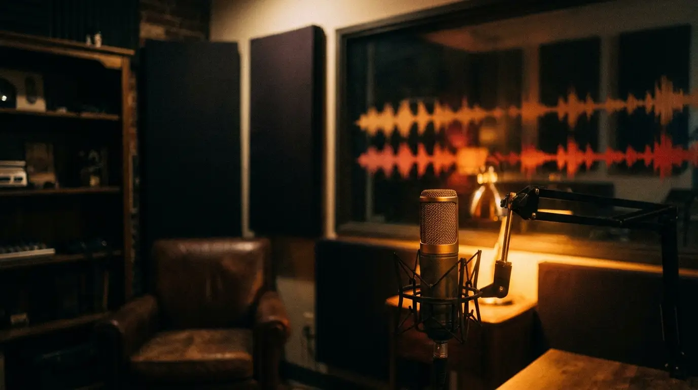
Skip the clichés — a microphone on your cover says nothing about your show, because every third podcast already did it. Prompt for imagery specific to your subject matter instead: a show about startups deserves something sharper than a mic with sound waves.
Episode art and the content flywheel
Per-episode artwork lifts perceived production value and gives every episode a unique social asset. The sustainable pattern is a template: keep your cover's layout and palette, swap one visual motif per episode theme. Generate ten episode variants in one batch and your feed instantly looks like a network-produced show.
Audiogram backdrops follow the same logic — generate 9:16 and 1:1 backgrounds with intentional negative space where the waveform and captions will sit.
Video podcast? You need thumbnails too
If your show also lives on YouTube, every episode needs a proper 16:9 thumbnail with guest faces and hook text — a different design problem from cover art, closer to standard YouTube CTR craft. Reuse your show's palette so the channel stays cohesive, but design each thumbnail around the episode's single most curiosity-provoking idea.